
September 21, 2012
The last days I spent quite of time playing to Batman AC made by Rocksteady. It’s a really good game and I was intrigued sometimes on how they managed to create the content of the game. So the following blog post is a breakdown of the game from my personal point of view (I don’t know at all how Rocksteady works). The purpose is educational and the work presented here go to their respective authors.
The following breakdown is based own my own guesses and how I understand the game from the textures and meshes I have extracted. I can’t tell you exactly if I’m right or wrong since I’m not a developer of the game. However, I believe I’m enough rational to think that most of what I say is close to what the developers have done. If you are a developer of the game and are allowed to talk, fell free to comment and tell me where I’m wrong.
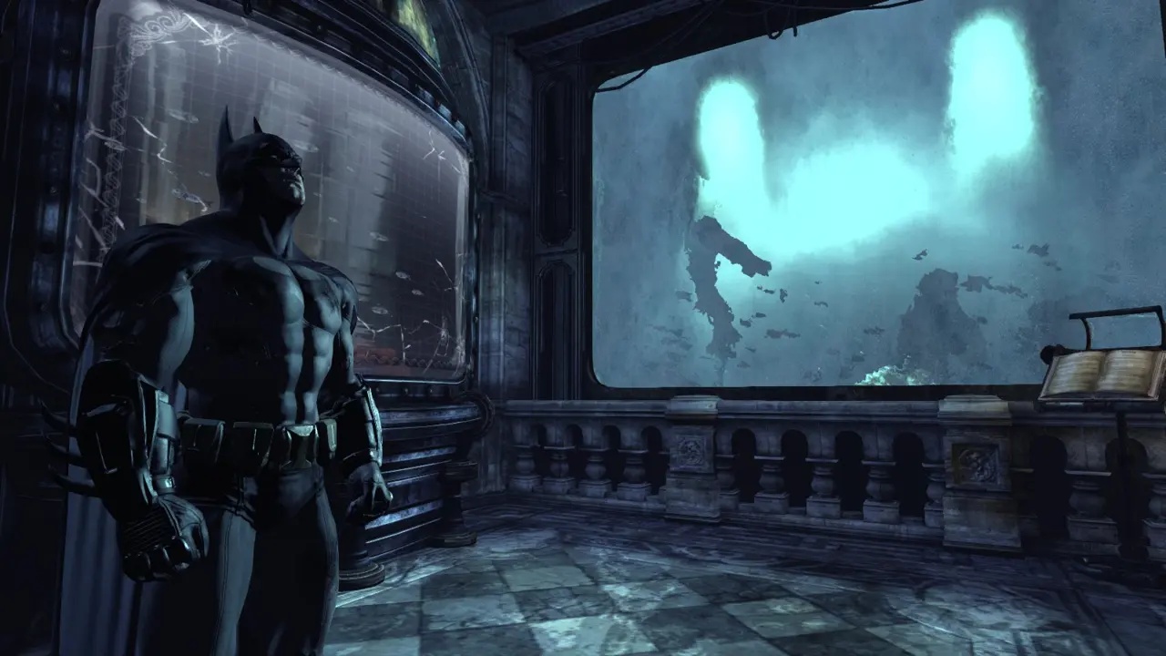
My firsts guess are directly from inside the game, on how the environment looks. It’s obvious that when you look at some in-game screenshots that the atmosphere is designed to enhance a very simplified set of colors. Often monochromatic. Which make me believing that the assets in game are often simple and the volume and colors come from the lighting. That’s interesting because it’s quite close from the way I make/think my own environment : a strong lighting which enhance the overall scene.


On these screenshots you have a very small color variance. You have mostly a global color which come from the lighting and the post-process. Then the texture add variations and some subtle tones. Some localized light also add a bit of variation but most of the time they are just a complementary color or in the same mood as the global color of the scene.
So, the lighting is here to give the global mood of the scene. The assets are often soft enough in their color to blend together. However, when you look at a scene, you see a lot of details. That’s another part of the artistic direction of Batman : a simple but strong lighting mixed with a ton of details in the assets (both from the textures themselves and also from the mesh silhouettes which are modeled with a nice level of polygons).
There is also some atlas texture, which often regroup objects of the same nature. For example a bookshelf will regroup some papers, book covers. Another example is a stone wall which regroup some tilling textures to create arch, railing, pillars, and so on.


The size of the lightmap textures are very low. I don’t think the game will be enhanced if you increase the lightmap sizes. Soft shadows are often more natural and for the Museum only a soft atmosphere is needed. There is so much details in the diffuses that the lightmaps doesn’t need to be precise. By the way, very low lightmaps reduce a lot the compilation time. On iterative layout design, it helps a lot to be able to quickly build the lighting.
Since the lightmaps are very low, when they are upscaled on the meshes ingame they are automatically blurred which then reduce the strength of the pixel artifacts. These artifacts are then blended inside the noise from the diffuse. So you see almost nothing.
The textures for Batman are very special. First, they are mostly monochromatic too. The metal which is sometime rusty blend some blue and red, but otherwise the tones are limited to one color. The wood is only brown and blend sometimes some white highlight. I believe the textures are made this way to not interfere too much with the lighting. As I said before, it’s the lighting which add color in the scene, the textures add only details and shades. The texture are also very, very noisy. I think there is two reasons why they are like this :
1- I think it counteract the fact that textures in a game are often blurred by the mipmaps and the bilinear filtering. This way they maintain and high level of details.
2- It’s for counteract the DXT compression. Batman use the Unreal Engine 3 which use the DXT/DDS format for compressing the textures. Since this format work by block of 4×4 pixels, you can get a "blocky" feeling inside your texture. With the noise you can control a bit how the colors will be interpolated. More info here : Making Quality Game Textures.


The diffuse and the specular textures are very noisy but for the normal it’s not always the case. From what I have seen, normal maps are noisy when a material is damaged. Often the metal texture have only a normal map to get a global volume, while the Diffuse give the rest of the details.
Also, after looking on a lot of textures, it’s easy to tell that 80% or even 90% of them are made by hand. Diffuse and Specular are made from photos, sculpt and so on. Some normals maps are made from sculpt sometimes but most of the time they are from a software which convert diffuse map to normal map. I suspect that the developers have used Crazybump, some gradient in the normal maps are typical of this software.
There is almost no baked meshes for the environment. Since almost everything is made by hand for the textures, it’s logical to find meshes which are only based on these textures. The Museum is a good example : a lot of meshes inside this part of the game share a single texture set. It’s a texture atlas which contain some bricks and ornaments. The arks, the walls, the stairs and the railing use these textures.


The lightmap UVs on these examples are clean but not exactly aligned to the grid. I guess that since the lightmap are very low, it doesn’t matter to have a perfectly aligned UVs. The pivot point of most of the meshes is also put on the corner (example : the floor) or at least to an extreme side (for example : the arch, the railing). Mostly because it’s easier to manipulate an object inside the level editor when its pivot axis is on a border (scaling and rotating are easier to perform).
Since these meshes are based on concrete/bricks, some of the normals are broken to enhance the sharp look of the material. It’s an advantage of this workflow by the way : you are totally free on your modeling since the textures are not based on your geometry (in fact, it’s the reverse : the geometry is based on the textures). The last image is an ingame screenshot which show the mesh ingame.


About the size : the railing for example is 128 unreal units high. Compared to the player size ingame, I believe that the characters are almost 256 unreal units high. For comparison, an Unreal Tournament 3 player is 96 UU high while in Gears of War the player is 128 UU high.
Just to quickly finish for the meshes : I have extracted Catwoman (not Batman yet) to see where the UV seams are placed, how the UV island are made, etc. Unfortunately the extraction process doesn’t handle well the UV seams for the skeletal meshes (every triangle is broken). However, Catwoman is made of 14131 triangles (which is a bit low a next-gen game today) but legitimate because Catwomam wear a close suit and doesn’t have fancy details to show. She is 192 UU high if you count the cat ears.


A small part but still interesting to note : the meshes and textures inside the game packages follow a very nice nomenclature. I find hard to make a good nomenclature when I work on a project and the one used for Batman is easy to understand. Maybe a bit long to write but at least it’s logical, easy to read and understand. I have noticed two big categories : the base assets which are used to build the layout of a level and the other props which are used to detail the environment itself.
It looks like this :
ARCH_Stairs_Museum_GrandSteep2
ARCH_Pillars_Museum_ArchGate
ARCH_Floors_Museum768
OBJ_DisplayCase_Museum_Board
OBJ_Filing_Large_Cabinet02
OBJ_MuseumExhibits_Fossil03
As you can see, the meshes which begin with "OBJ" are used as decorative objects in-game. Such as a chair, a bookshelf, a door, and so on. The other meshes begin with a specific word (here the "arch") and are grouped inside a family (with sub-family) to easily find and build the environment. Here the family is Arch with Pillars, Floors and Stairs as a sub-family. Some meshes have a generic name but contain a size : it’s mostly a modular mesh which tell by it’s name the size of its tilling. Here we have the "Floors_Museum768" which is a big square of 768×768 unreal units (a power of two to easily duplicate, snap and scale it).
Of course there is still some objects without a specific name but almost 75% of the meshes are named according the nomenclature. It’s a nice organization.
During this analyze, I didn’t extracted and opened all the packages available with the full game. I have mostly focused myself on the Museum (my favorite part of the game). It would take too much time to take a look on all the packages. However, I believe the production of the game is consistent, so my analyze would probably fit on the entire game.
What to say now ? If Rocksteady decided to use a lot of hand-made texture for the game it’s probably because it was the fastest way to build and iterate. From what I have read, Rocksteady is a studio with 90 people working inside it. It’s an honest number for a good quality game.